Cd Cover Artist Statement
b. Who is your target audience and how does your design address this?
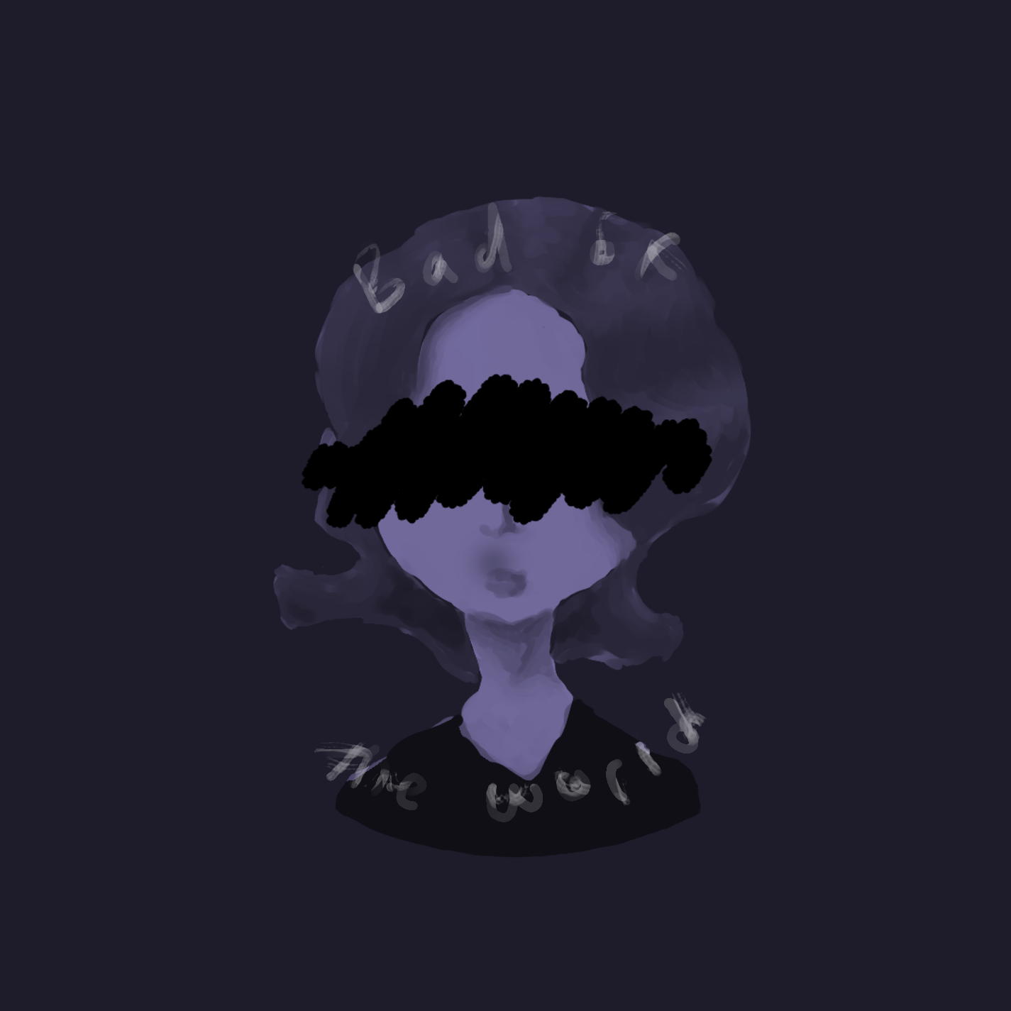
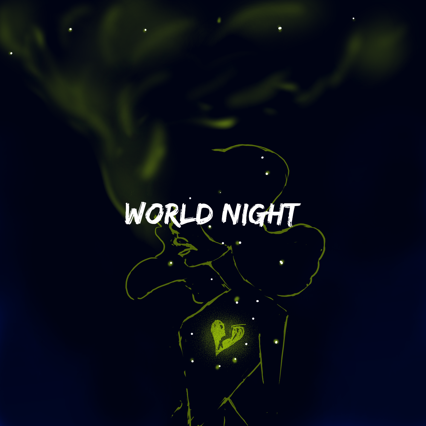
My target audience for this album cover is those who listen to artists such as Melanie Martinez and Marina and the Diamonds, and the songs are supposed to be in pop, indie pop, and art-pop. From what I have in my head, this is the artist's first album and they simply name it after their stage name World Night. Their music is supposed to be, I want to say sad, and about them escaping society and themselves as shown by the smoke, representing the part that wants to longer be held down, and the heart, their soul that’s tethered down.
c. Describe the skills and software employed to achieve your objective.
The software I used was Medibang paint, a free digital drawing software extremely similar to Photoshop, the various blending modes it had to offer, and masks (prior to the tutorials, I only knew of clipping masks, and I utilized both options in this piece). The skills I used were that of colour theory (with the blues and yellow-greens), the C.R.A.P. principles (where the images were in relation to each other and the page, the light elements being repeated, light (green/white) v.s. darks (black/blues)), typography (in the font of the album title), and that of digital drawing (all elements were drawn).
d. Outline the challenges you anticipated and the challenges you encountered, and how you dealt with them.
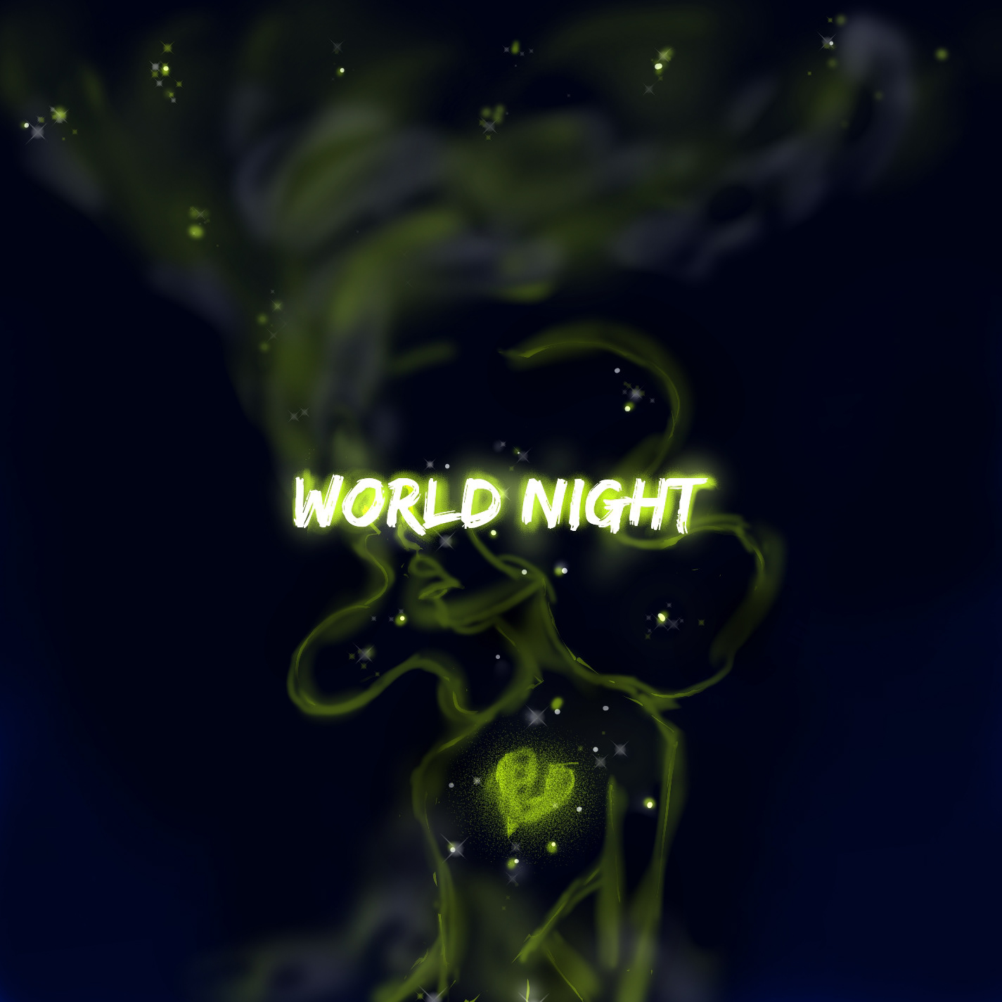
During this process I faced multiple challenges. I went through two sketch drafts, then created three digital drafts, before fine-tuning one of the digital pieces to the final product. I had trouble trying to balance out the darks in the smoke, and tried to fix it by adding a gray but, in the end, it was too light. I found the sharpness of the body lines to be too sketchy, so I tried to solve the problem by using airbrush instead. While it added emphasis to the title, I lost the focus on the glowing heart as a result. I tried to make the stars bright and sharp, but was unable to pull off the galaxy theme I wished to have and turned the opacity down so they were burnt embers.
e. The outcome: what did you learn? Did the piece meet your original goal/objective? Does it successfully address the target audience?
The piece did not at all meet my original goal/objective. I find myself hating it and loving it - I find it too sketchy. I probably should have used digital photos rather than hand-drawn, however I wanted to challenge myself to try and make it a clean image. I learned about squinting, and how it could be used to balance the black/white/gray tones in an image, and found that I’m not the greatest at it. I’m not sure it addresses my target audience, as the other album covers I referenced had a lighter colour pallet to hide the dark and wacky themes the music covers. Maybe it did???