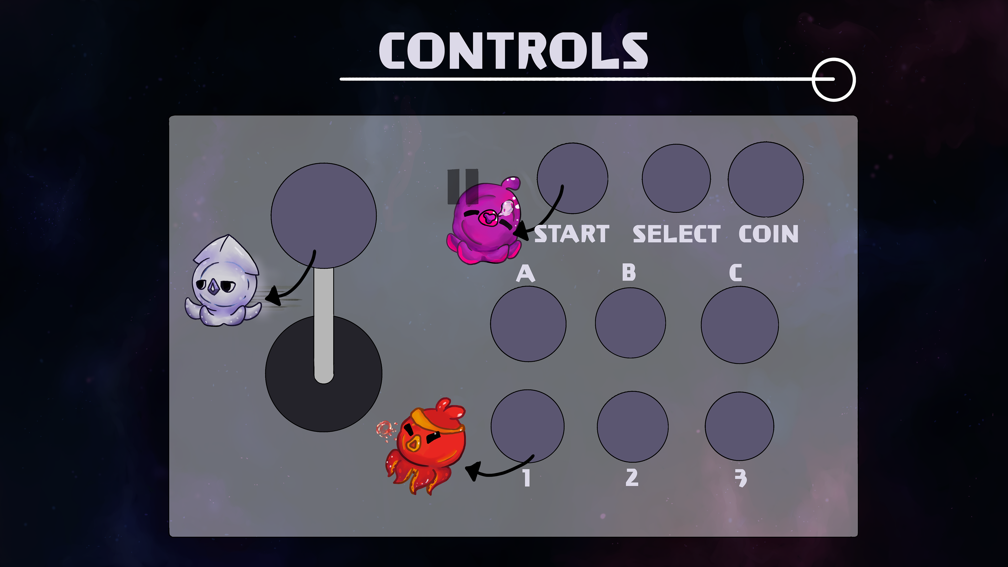
Inkyway Galaxy: Takoyu Rescue! is a casual, cooperative, top-down shoot 'em-up inspired by classic arcade games in 2D, hand-drawn graphics. Up to 4 players must work together to defeat waves of enemies but individually compete for the highest score. The game follows four space-octopi as they fight their way through the evil scientist Dr. Moray’s ship to free their missing sibling.
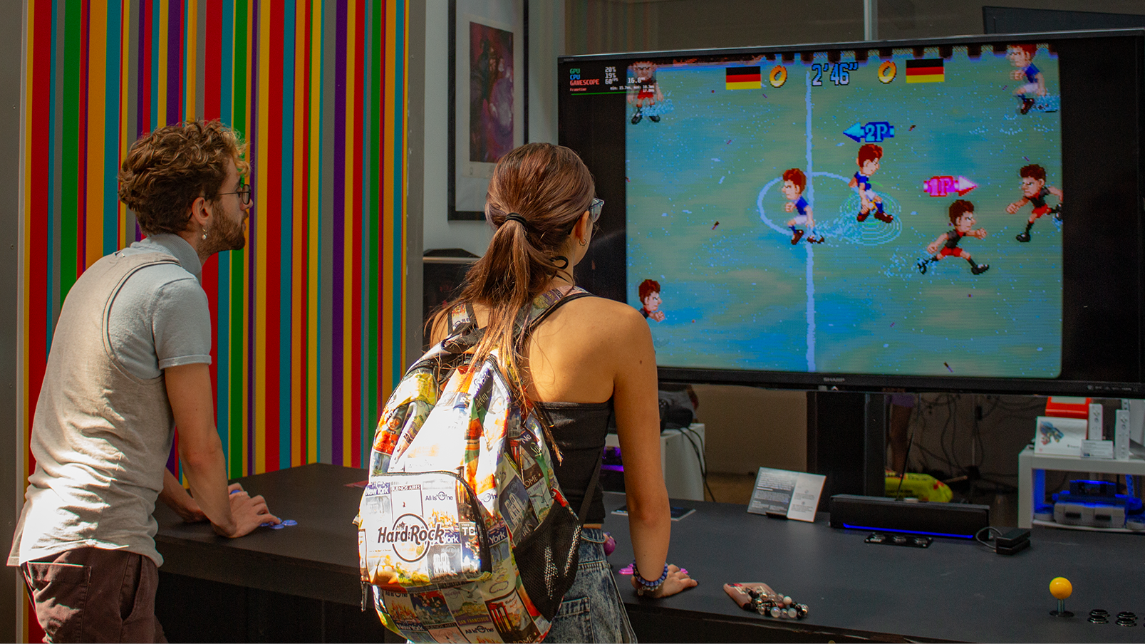
Version 1 was designed and produced by students in the RTA 828 Fall Class of 2023 under the supervision of Dr. Kris Alexander. It was created in Unity (C#) and designed for the Community Arcade Table (CAT6) at Toronto Metropolitan University. An executable version is available for download.
You can read more about my process in the project below.
RESEARCH
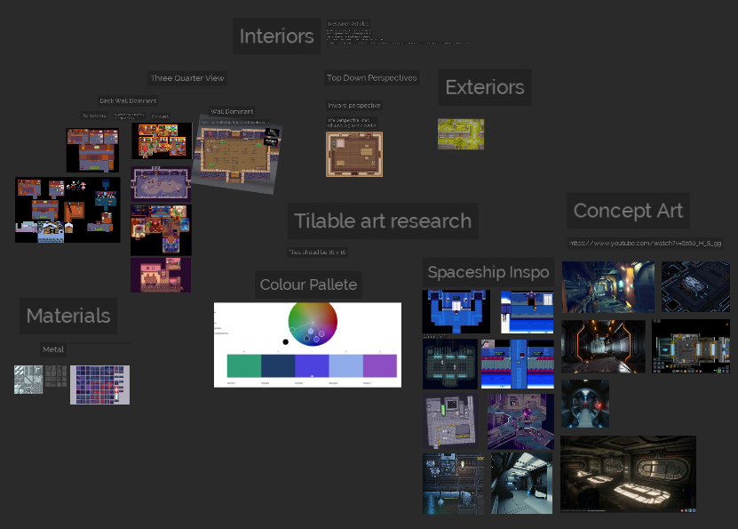
Mood Board and Art Study
At the base of any good work of art lies a mood board - a compilation of references to guide you based on the image in your head.
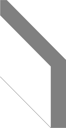
The mood board for this project allowed me to realize several things throughout this process. One being, that there are multiple ways to draw perspective; and although the art style requested was a top down perspective the game demo provided had used a Three Quarter view - of which there seem to be three different ways to draw.
After grouping reference assets decided on two categories for the pixel art Three Quarter View - the Back wall dominant (Where-in the players only see the tiles of the full backmost wall to creat perspective) and the Wall
Isometric perspective Concept Art
Three Quarter View Concept arts
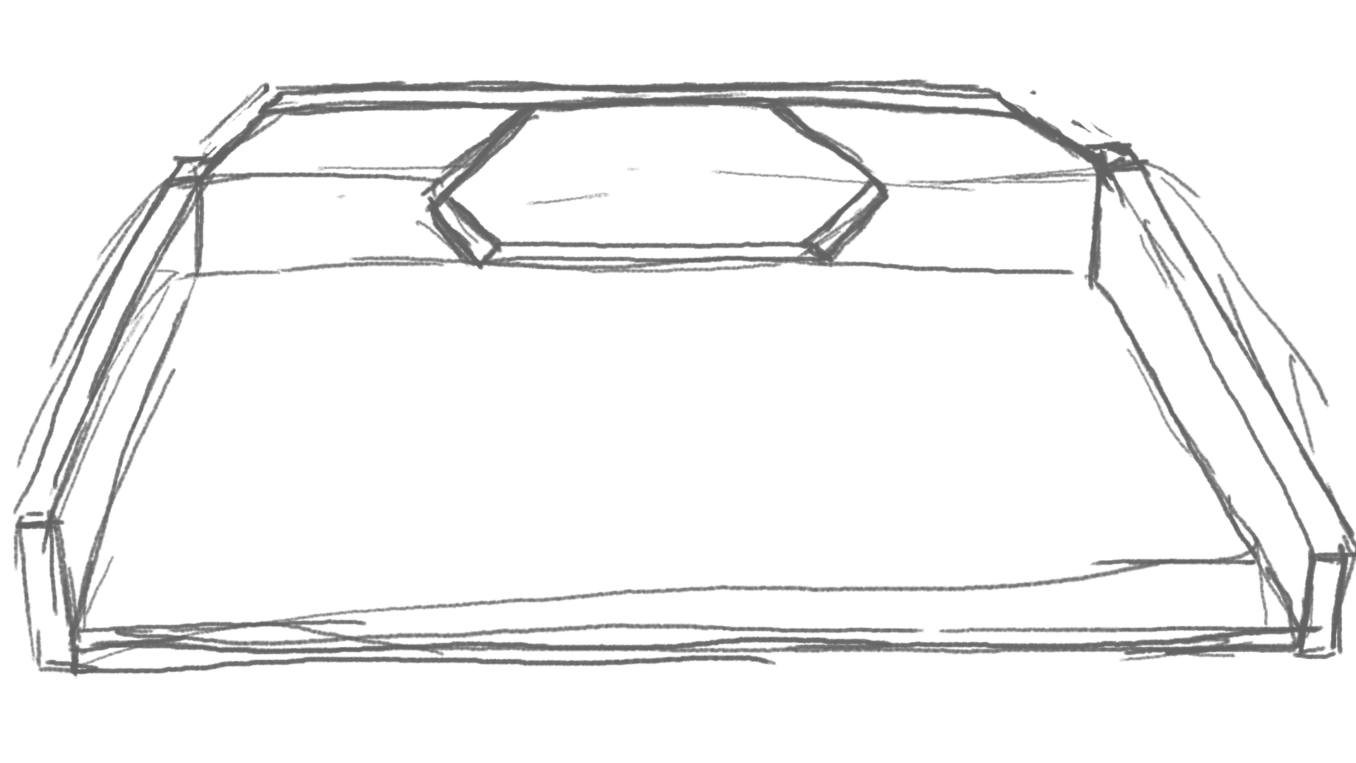
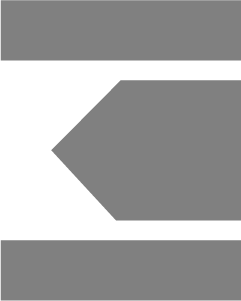
With an understanding of the window, I came up with two very basic concept art/layouts of the way in which the map could look. One features more traditional rectangular doors, and the other a hexagonal design. By the time I was working on the second design as well, I was deep into developing how I would break down each asset to make them tileable at scale - and the black and white schematic illustrates my initial thought process.
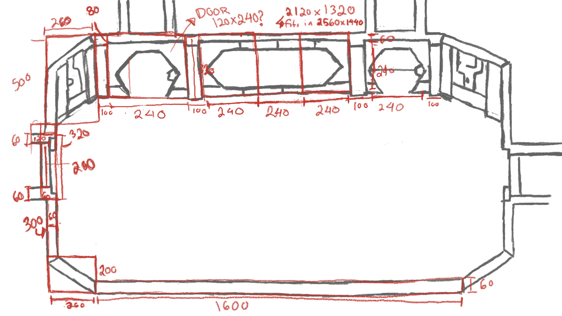
To Scale Level Block Outs
Based on both my planning/sketch and research, I created a to-scale layout of each of the modular/tileable assets in Adobe Illustrator that can be drawn over to allow the environment artist and coders more freedom to edit the overall floor map as they see fit.
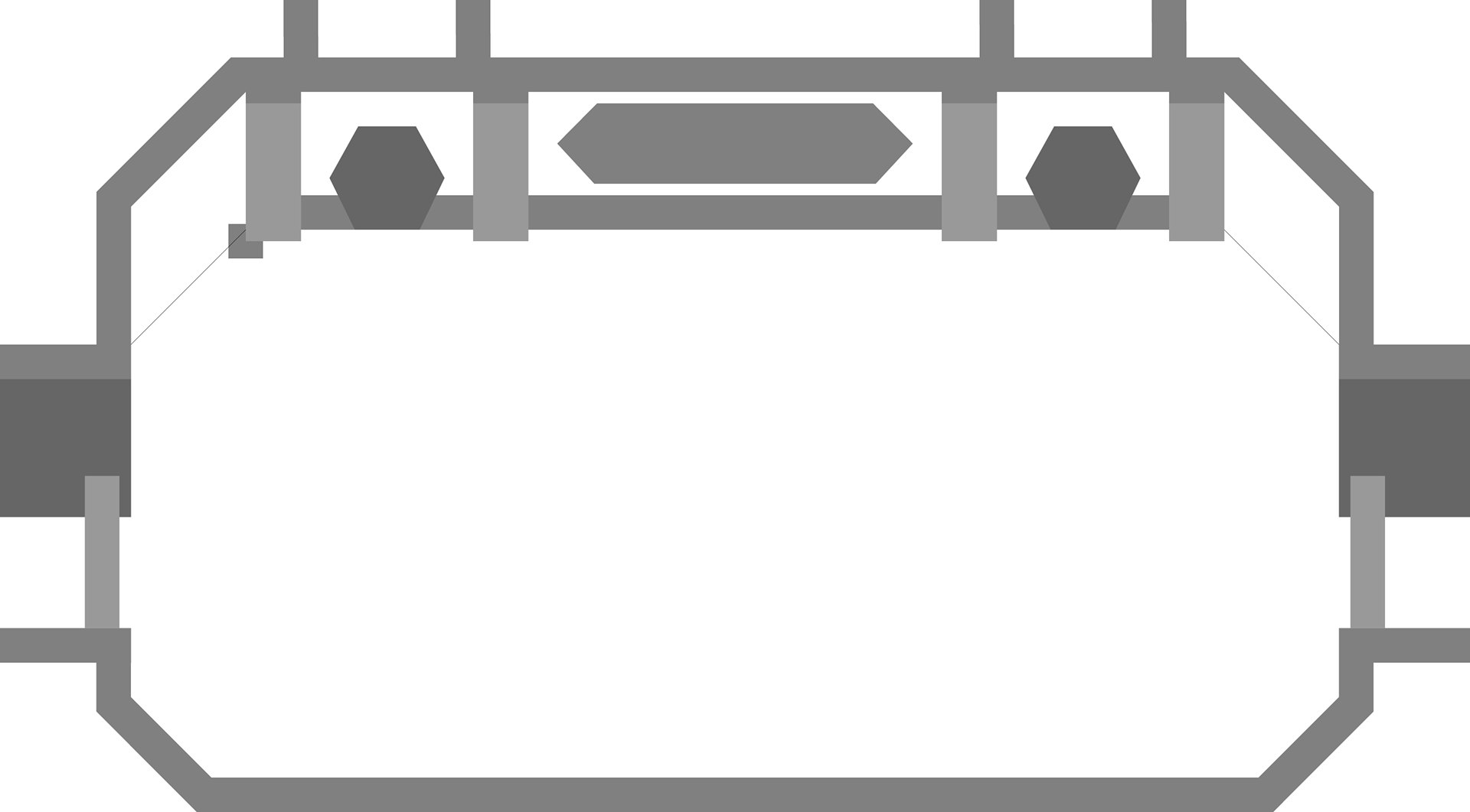
Base Tilable assets from Level Block Outs
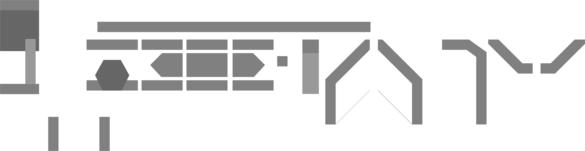


bottom left corner

Bottom right corner

Pillars

Exit Left

Exit Right
Top left corner
Top right corner

Doorway

Doors exit
Window Left Most

Window Middle

Window Right Most
Blockout Assects V.S. Textures Block Outs

Interview Questions with Kaylin Anderson
In order to really understand the way concept art works within a professional setting, I reached out to various artists on LinkedIn to ask for some advice as well as their own experiences. The Artist who replied was Kaylin Anderson - and below is a transcript of the questioning process.
Me: What would you say are the most important things to include in a concept sketch for an environment?
Kaylin: I'd say the most important things to include in concept sketch are what is listed in the brief that was given. I find it is best to have a variety of designs to choose from early on so the client feels included in the decision making , starting a conversation about what works and what doesn't, so you create more precisely what they're looking for.
Me: Do you have any recommendations for file organization when it comes to multiple artists using a 2D style?
Kaylin: It's best to include the project name, the name of the piece, the iteration number and your name if there are multiple people working on it. I like to have underscores in between each section for more legibility. It should also be done in the same format every time to keep organized.
Me: When presented with a prompt, what rituals do you have to help you narrow down what you create?
Kaylin: When presented with a prompt I highlight the key terms of what needs to be included and what direction the art must take. I then start making thumbnails. Somewhere from 6 to 10 and more if I feel so inspired. Most of the time you start finding more and more creative designs as you continue to explore. The key is not to get carried away with detail or colour. It's just about shape language and getting the ideas out. Letter or number each thumbnail so people on the team can easily say which they are drawn to and say why more clearly.
Me: Have you ever had to create concept art for an environment that is anticipated to be in a different aesthetic than your usual sketching style? If so, did your work at all change to reflect it? (i.e. matching the style, or sticking to your own because it is a concept) To bridge off of this, I've seen in some art book artists creating concepts in their style and then having various versions before they to a final.
Kaylin: Yes, I have had to adjust my style to match that of the project. Our job typically requires this as it is not a personal project, it is a team project, but still needs a cohesive visual in the end.
Me: Do you find making various very quick sketches to be the best way to iterate through ideas? How long on average, would you say one should work on a sketch?
Kaylin: Yes, I find this is best. Concept artists are problem solvers and there are usually many various solutions to a problem. We must find the right one and sometimes that requires a lot of designs that aren't quite right. Various designs force an artist to really tap into their creativity and imagine something new from their previous ideas usually getting more and more unique as you go. Though there is no telling which design will be chosen in the end.
Me: Do you have any experience making modular/tileable 2D assets? If so, what has been your experience like with them?
Kaylin: I haven't had much experience in this, no. I have made one or two tillable textures to bring into 3D modeling as well as I once made a tillable pattern to create floor tiles in an environment piece, but that's the extent of my experience.
Me: And finally, what is the process like when you present your concept to the rest of your art team? And what would you say is the best way to lay out/ presents the concepts for those outside of your team (the other teams that are part of the project, or even public profiling)?
Kaylin: Whether it's the preliminary sketches/ thumbnails or more polished work, if you have more than one piece to show labeling it with a letter or number (or titling it for finished work) makes communication easier and people will be more able to focus on the actual artwork than trying to figure out how to let you know which piece they're even referring to. It is also important to remember that critiques are not personal and wanting changes is not a reflection of talent but just subjective preference for a preconceived vision. Adapting to changes to a project can lead to a more successful end result.
Study Sources
Game Playing Perspectives: Isometric. Peachpit, N/A. https://www.peachpit.com/articles/article.aspx?p=98834&seqNum=4.
Game Playing Perspectives: Top-Down Perspective. Peachpit, N/A. https://www.peachpit.com/articles/article.aspx?p=98834&seqNum=3.
Garcia, Janet et. al. Perspective and Points of View. IGN, March 2020. https://www.ign.com/wikis/video-game-dictionary/Perspectives_and_Points_of_View.
Mort Mort. My Tileset Workflow (Pixel Art and Gamedev Turorial). Youtube, October 2018. https://www.youtube.com/watch?v=btnH0x7_1g8&t=929s.
Saultoons. Pixel Art Tileset Tutorial (Top Down Pixel Art). Youtube, January 2021. https://www.youtube.com/watch?time_continue=1&v=gij7lpQv-qo&embeds_referring_euri=https%3A%2F%2Fwww.bing.com%2F&embeds_referring_origin=https%3A%2F%2Fwww.bing.com&source_ve_path=Mjg2NjY&feature=emb_logo.
Saultoons. The Ultimate Concept Art Tutorial. Youtube, May 2022. https://www.youtube.com/watch?v=6z60_H_S_gg.
Three Quarter View. All the Tropes, N/A. https://allthetropes.org/wiki/Three-Quarters_View#:~:text=Examples%20of%20%20Three-Quarters%20View%20include%3A%201%20Adventure,Dragon%20Quest%207%20Dragonstomper%208%20Elona%20More%20items .
Three Quarter View. TV Tropes, N/A. https://tvtropes.org/pmwiki/pmwiki.php/Main/ThreeQuartersView.
Tyler Edlin. Design Basics for Concept Art. Youtube, January 2023. https://www.youtube.com/watch?v=nLvbXDXR7wA&t=1688s.
CREATION
Art Style Study:
When it comes to learning a specific style, the best action one can take is it study it. Whether it’s immersing oneself in the culture/aesthetic, disassembling multifaceted objects, or learning intended and unintended uses of a tool – learning is essential to emulate or understanding the patterns associated with a singular thing[1].
As discussed in the research portion of the course (specifically my third assignment), one of the best ways to understand a specific art style is to compile a mood board consisting of various pieces falling into the same category. Although last time focused on understanding the specific patterns of a three-quarter view perspective, and how pixel art from the proposed modular assets would look from this art style, the entire production team has decided to utilise a 2D rendered look inspired by the side scroller game Hollow Knight.
With this in mind, the art team compiled a general mood board (as shown below) before coming up with a couple general principles to keep in mind.
Hollow Knight, in terms of visual themes, consists of a mid weight stroke line on each object (with exception of special fx) and a textured brush that can be blended together to varying degrees. It plays with perspective by having objects in the back appear more washed out (with skylines/floor to ceiling walls having no outlines at all) and atmospheric lighting elements such as particles, fog, or god rays peaking through to add more variation. The art style, as well, is either done in vector or a resolution so large players can no longer see the pixels.
With the team’s study in mind, I added a section to a new personal Pinterest mood board (linked here and focusing on backgrounds) for further references when coming up with my first new asset to try out the style – the door.
Created Asset for the Week:
In terms of creation for myself, I decided to focus on one asset to play around with brushes, re-acquaint myself with the resolution, and try to find the best blend modes.
The thing about my current art program, is that - although it is free and I will likely be using it after I lose my adobe subscription from the school – Medibang Paint (like Photoshop) is a pixel-based drawing program. When it came to drawing in a pixel-based art style this was especially suited – I didn’t have to worry as much about soft lines suit looking distorted as everything had SOME degree of pixel to it. The art board size, in this sense, also did not affect the resolution as much – and even worked in its favour.
When I started the new drawing however, it became increasingly apparent that this resolution would not hold up – and so I had to test several different canvases (all with the same ratio) to ensure that it wouldn’t be too pixelated, but also not too large.
When I finally settled on one, I had to decide which brush was best suited. It became increasingly apparent that Hollow Knight may have been done in a vector-based art program – meaning the lines would be extremely crisp the closer you zoomed in while working on it, as it uses math to calculate what the colour in the pixel of the led screen – so I had to, after sketching out the first block out, ensure the brush would look clean as possible when zoomed out. I also had to try and make my lines as steady as possible – which is increasingly challenging given my main technique of outlining is to use multiple tiny strokes for one large piece. I found a brush type size that was suited though, and am decently happy with how it looks.
I’m fortunate though, that Medibang has several amazing watercolour brushes – and how much they blend with existing colour on the canvas is extremely customizable. With this in mind I played around with different blendmodes to texture the metal (it’s actually a multiple layer that uses the watercolour brush to mix white and gray) and tried out various lighting styles. (which I admit is not very much my strong suit.)
[1] Thing, as a term, is used in this case to address a singular concept, idea, theory, art style etc.
I’m content with how the final result
came out though, and will use what I’ve learned in
the rest of the background elements.
The Final First Level Environment


Wave Announcer Character
Initially it was requested that I add a screen into the background to declare what wave of enemies was being fought.
I wanted to try my hand at something else - and proposed a character to fly across the screen with a banner to announce the waves. Although they didn't make it into the final cut, they were super fun to try.
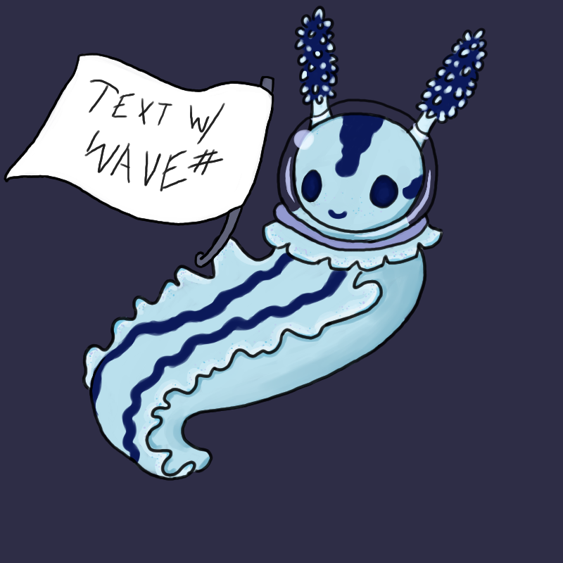

Little bit o' Flavour Text
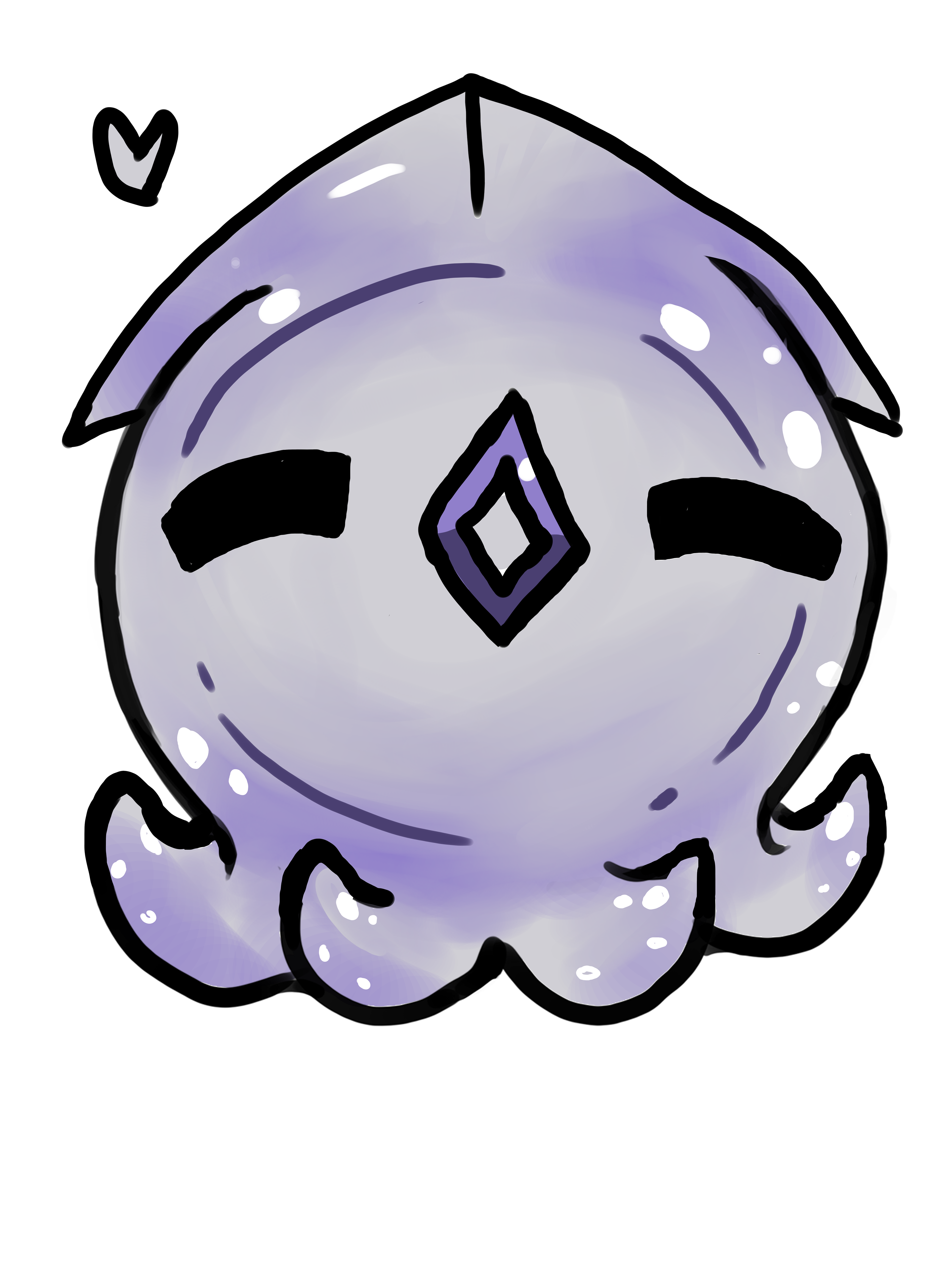
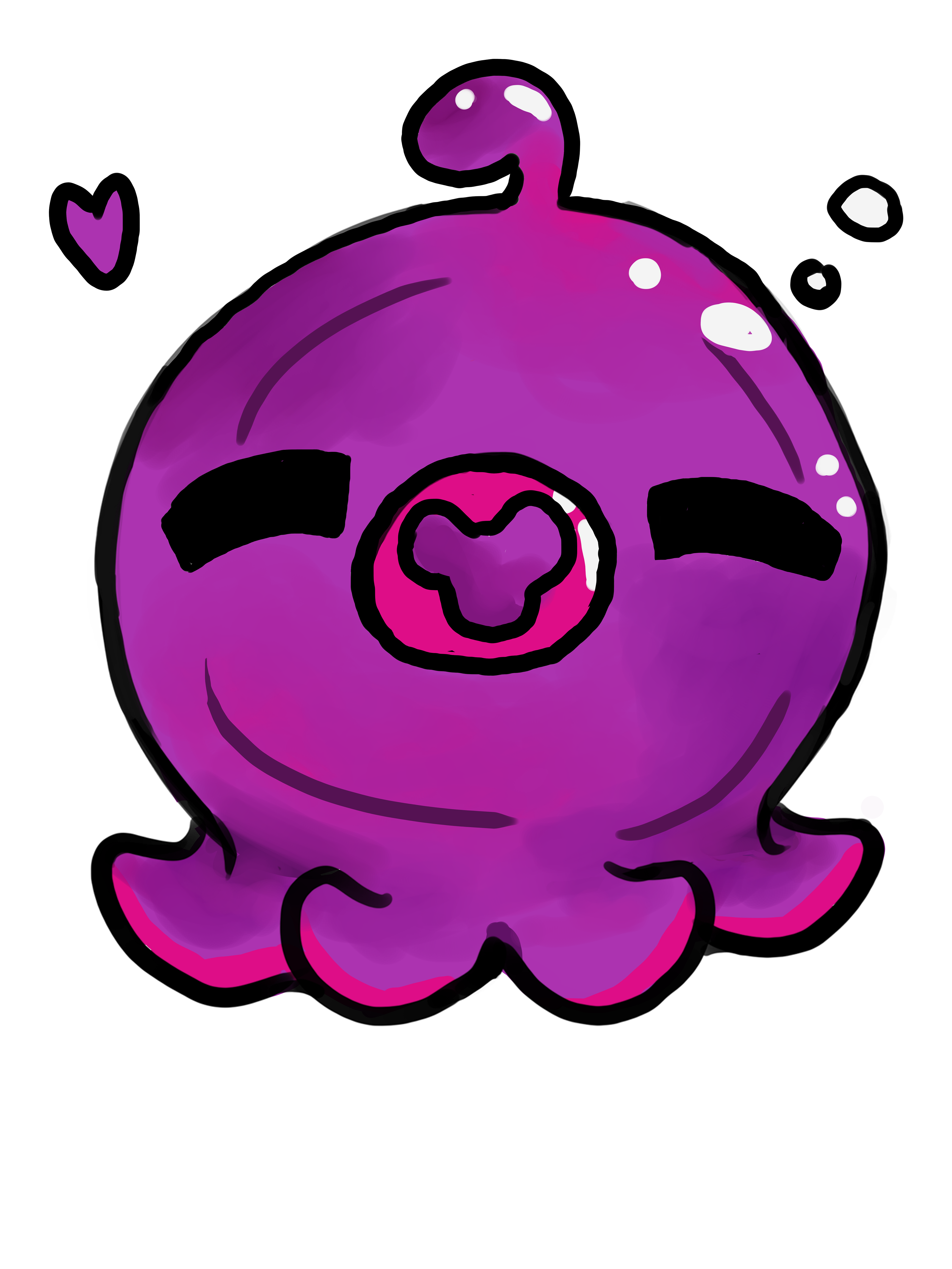
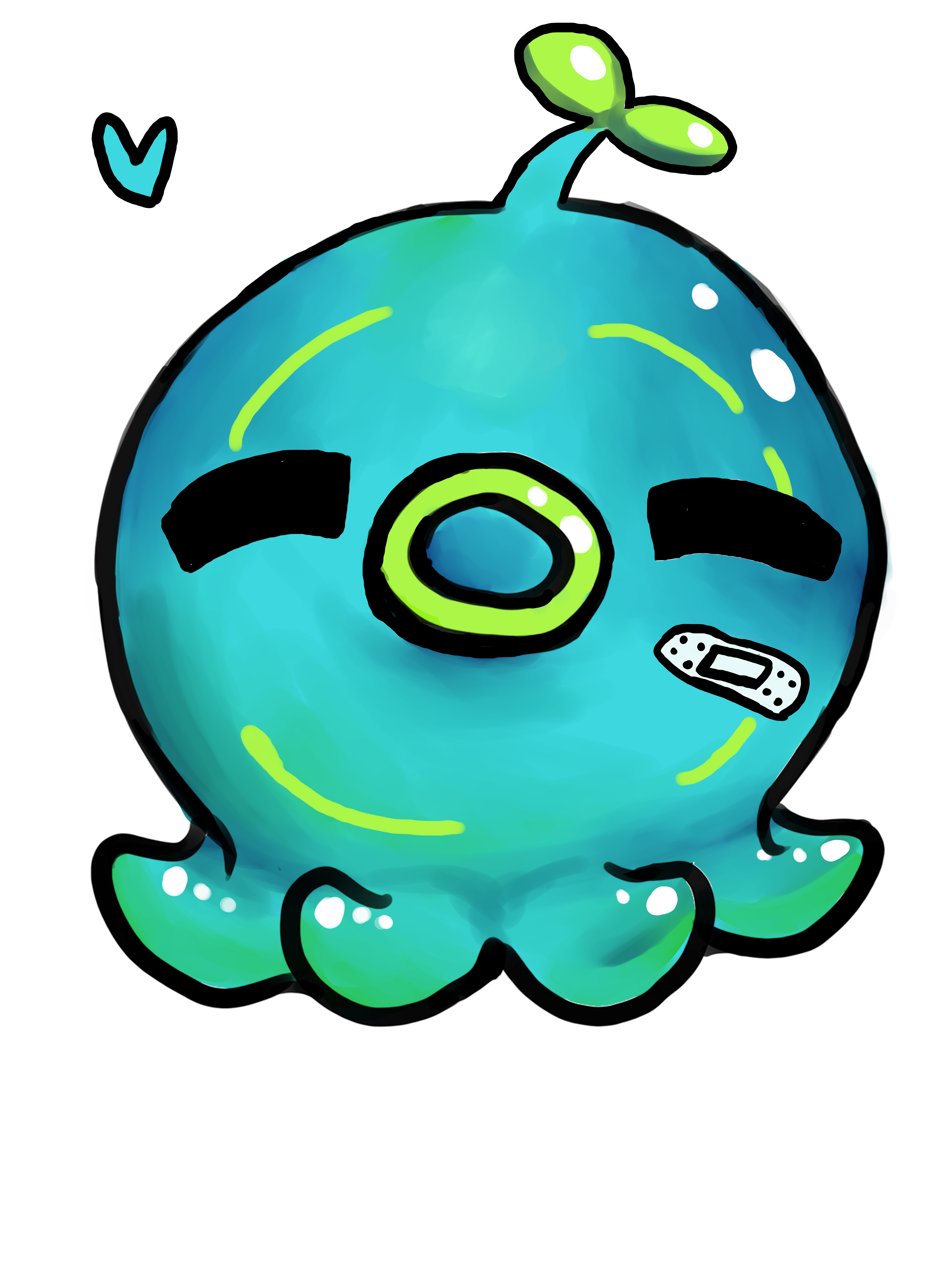
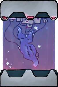
Based upon the Blue Chromodoris Willani sea slug, Chromo is a character that was probably ejected into space for being a scientific failure. They keep finding their way into the ship's orbit much to the misfortune of the enemies.
They got their head stuck in a clear bowl - but it's okay cause it makes them look like an astronaut when floating around.
They don't actually breathe anymore.
They eat stardust.
No one knows why they keep coming back - except the scientist who experimented on them in the first place.
They look a lot like the slugs locked in the labs...
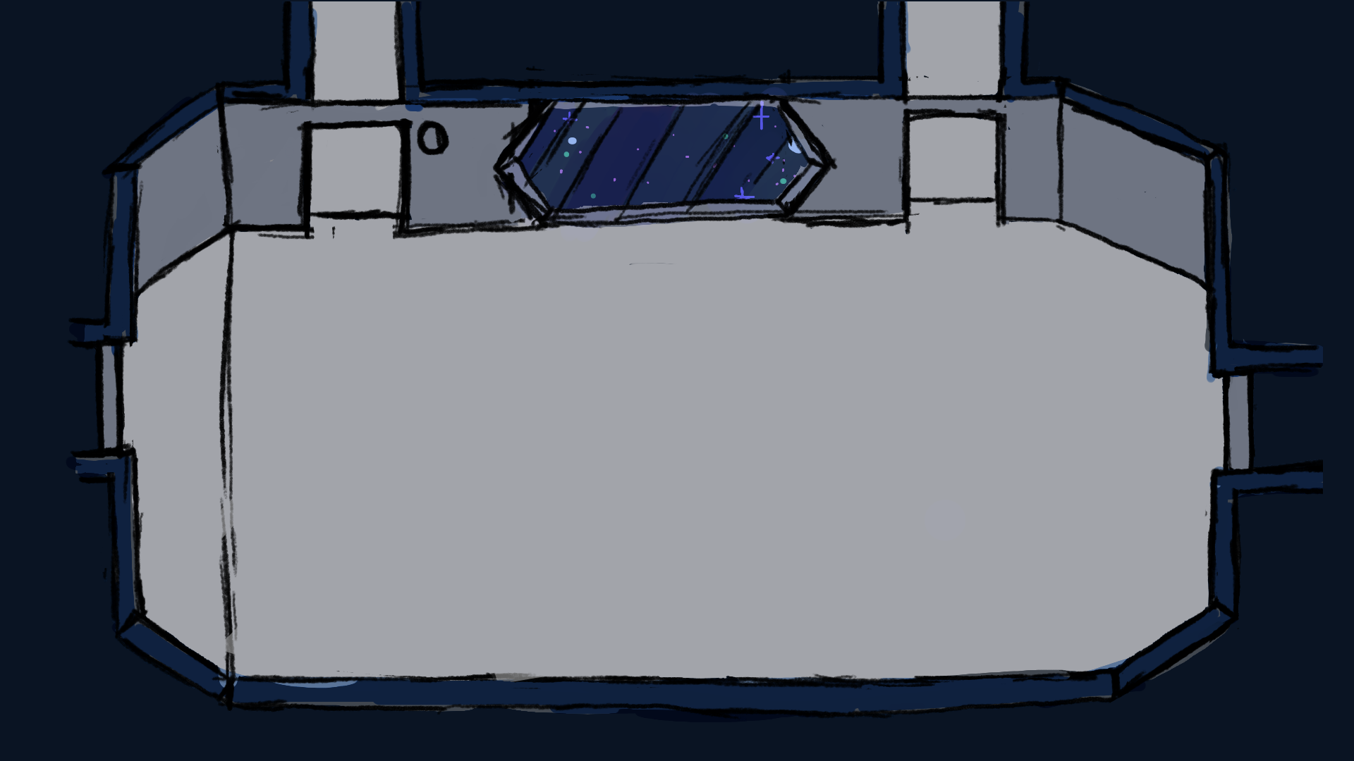
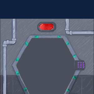
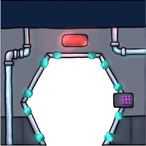
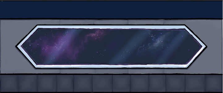
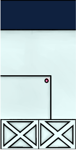
First Level Environment V2
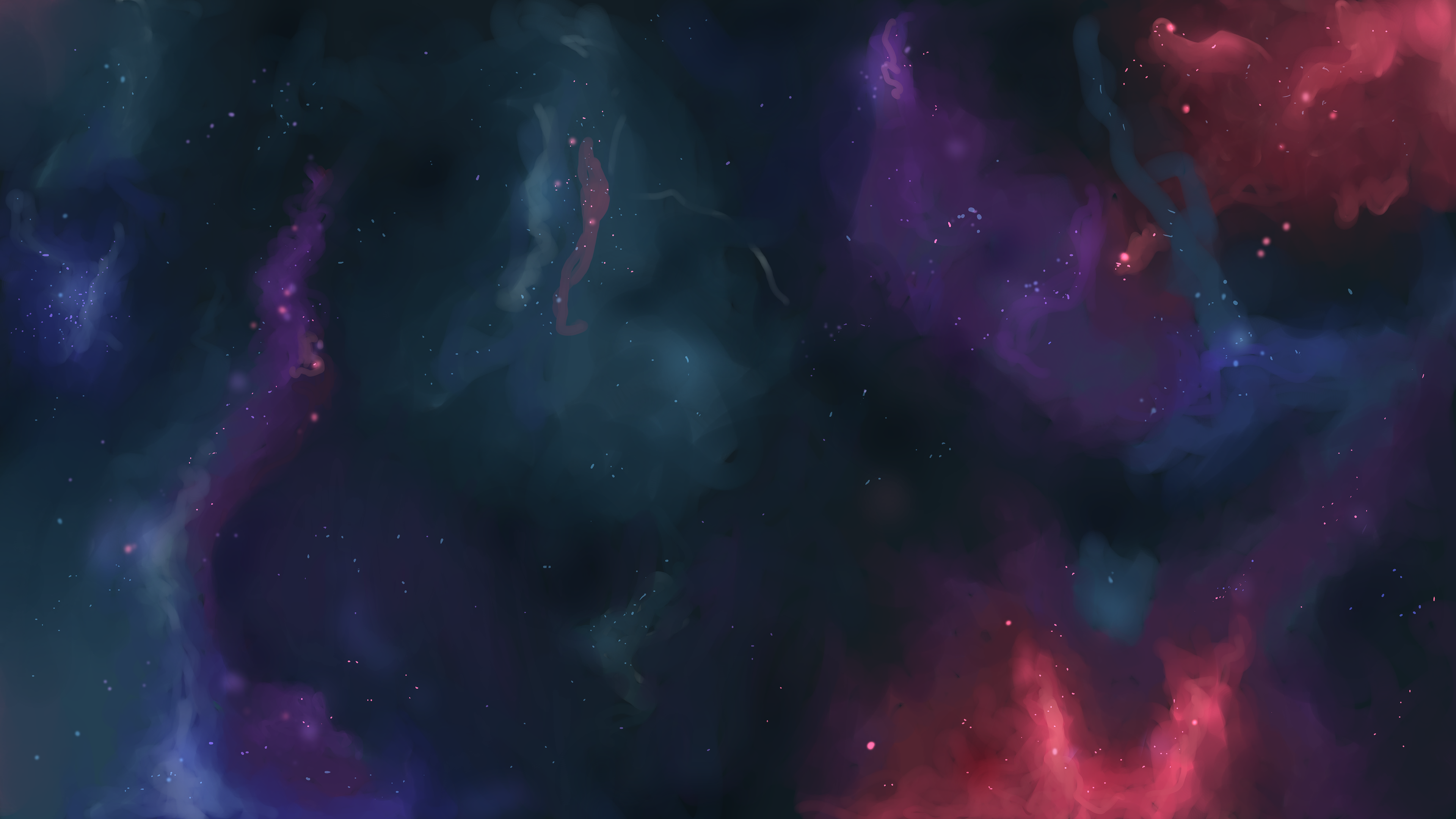
Due to the fact that the border of the initial and proposed new-level blackouts are odd shapes (and thus don't meet the border of the screen) it was requested that I make one of my favorite things - a galaxy background.
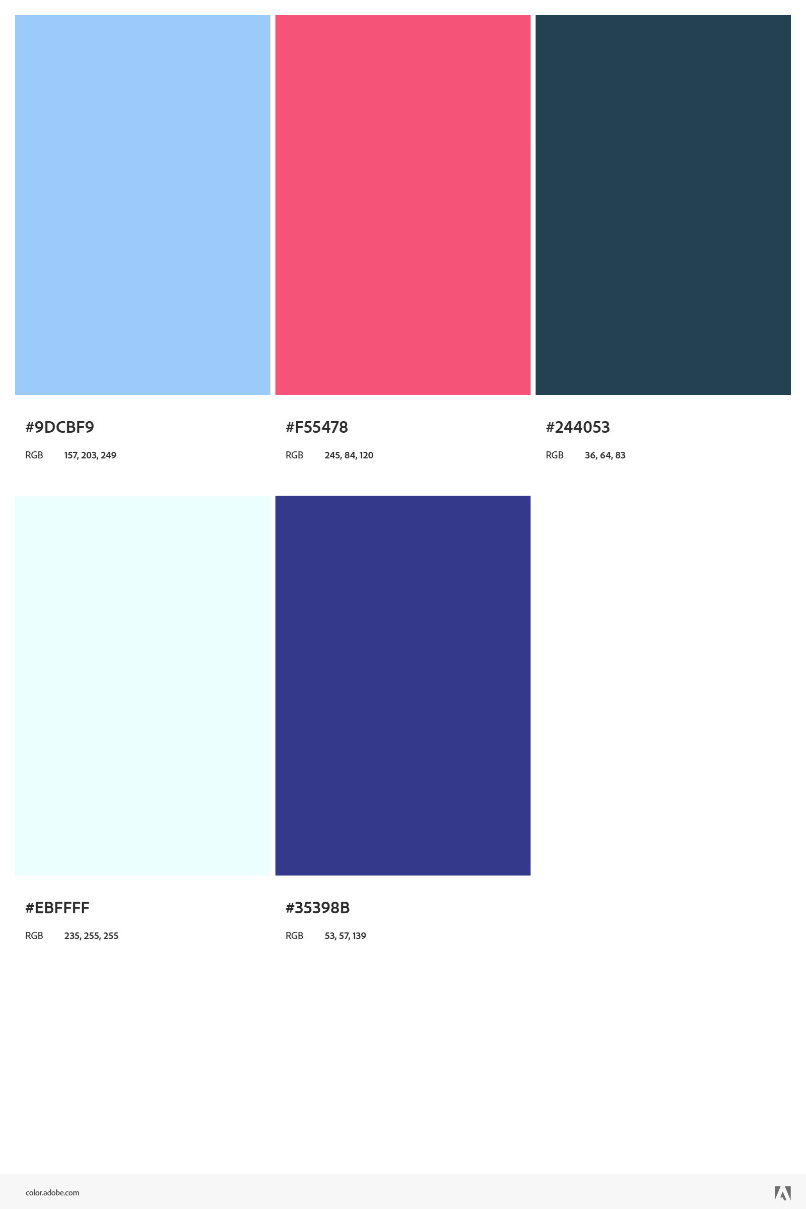
Utilising the requested colour pallet plus a shade of purple, I made use of the watercolor Brush in Medibang paint to blend together the beautiful shades and play on how saturated each "pigment" was and how soft they would fade into the lights and darks.
REFINE
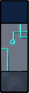
Although the first version of the assets worked in their purpose of being modular, feedback from players expressed confusion about where exactly the level took place. With this input Level Design provided a new layout sketch that I adapted into Adobe Illustrator to ensure the assets were to scale and would fit into the screen size of 1920 x 1080.
Initial Blockout


Refined Blockout
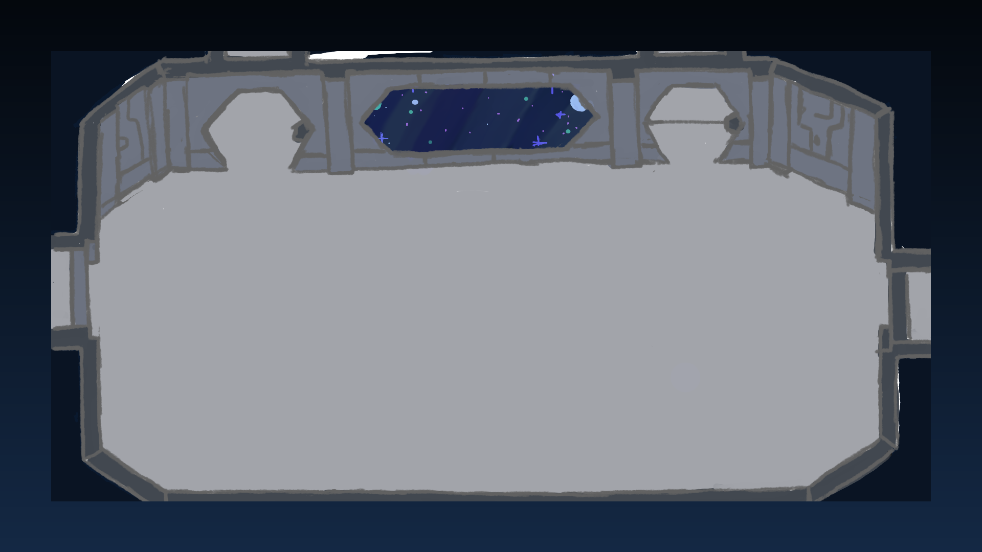
As to not replicate the same confusion, a mood board was made to nail down how to “science fictionify” the space. I also binged science fiction classics - such as the first and second Alien movies and episodes from the StarTrack: Enterprise series - to understand the atmosphere as actors would walk around them on set. They had a lot of narrow halls - so in the modular asset breakdown, I added a blank tileable wall asset. The second version of the blackout also featured textured variants - the same-sized assets painted differently. This allows the level designers to have more choices for the way they lay things out and creates a less static environment.
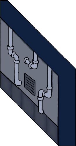
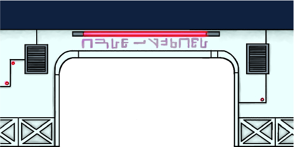
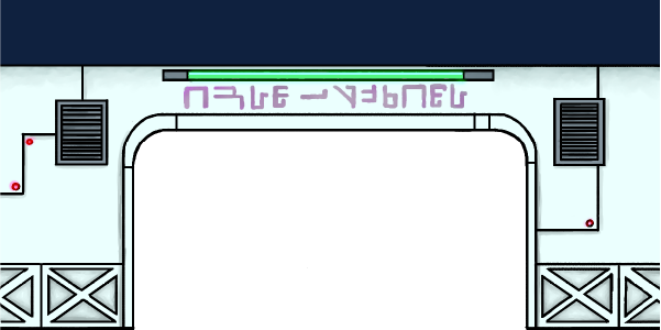
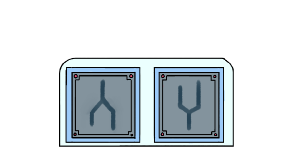
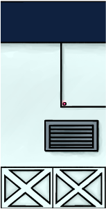
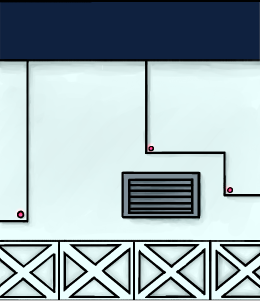
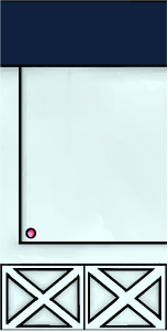
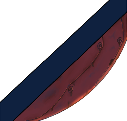
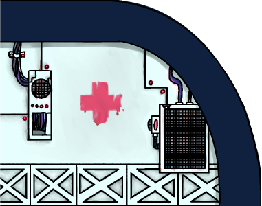
Below you can see an example of the Medbay - doors with some Alien sigils written, lines where the metal-plated walls meet, a cryo chamber that houses one of the scientist victims, and a bit of the hull exterior. Based on other noted trends from the mood board, x shaped decals were added to the bottom of the walls.
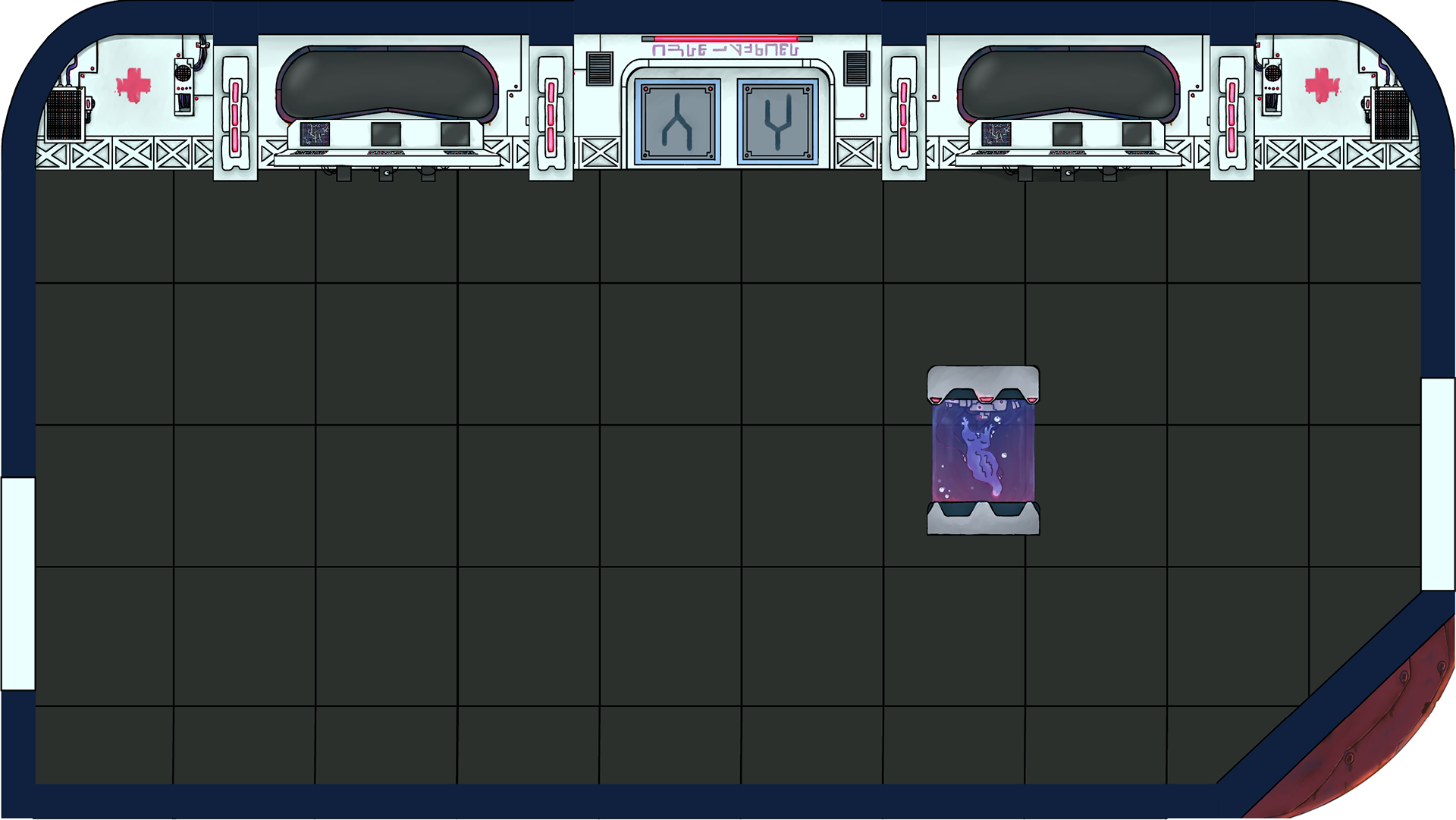
Background Assets
This section shows all the variants for the assets - as well as the files as they were individually sent to the level designer.


Prop Assets

Prototype (Final Deliverables)